Evolving a fragmented reporting platform into a connected sales workspace
Sales Overview is an internal First Trust platform supporting advisor research, sales reporting, and wholesaler workflows. As the sole product designer supporting its modernization, I lead UX/UI direction and collaborate with engineering and business stakeholders to simplify navigation, establish shared design patterns, and translate user feedback into more actionable tools—all while the platform remains in active use.
Role
Senior Product Designer
Company
First Trust Portfolios
Timeline
2021 — Present
Collaborators
Engineering, Sales, Marketing, National Accounts
34 original navigation destinations reorganized into 5 primary entries
Approximately 8 hours saved monthly, reported by one wholesaler
Ongoing modernization of a live enterprise platform
A platform that had outgrown its original structure
Sales Overview had accumulated reporting tools and workflows over time, but its navigation, interfaces, and underlying design patterns hadn't evolved at the same pace.
Thirty-four navigation destinations competed for attention in an expanding sidebar. Pages developed independently lacked consistency, while wholesalers continued relying on spreadsheets and Dynamics 365 for information and workflows that Sales Overview could potentially support.
The challenge wasn't simply updating the interface. It was determining how to make an established platform more intuitive, cohesive, and useful without disrupting the people who depended on it.
The original navigation grew as functionality was introduced, with limited opportunity to reconsider how destinations were grouped or prioritized.
Understanding how people actually worked
My initial review of Sales Overview identified navigation and interface inconsistencies, but conversations with Sales, Marketing, and National Accounts revealed broader workflow problems.
We learned that wholesalers frequently worked across Sales Overview, Dynamics 365, and spreadsheets to research advisors, prepare for meetings, and manage sales activities. Existing advisor profiles provided useful reference information but did little to help users determine what to do next.
Working with stakeholders to understand these workflows helped us prioritize improvements that addressed the underlying needs rather than simply updating the interface.
What we learned
Fragmented workflows
Users relied on multiple systems and spreadsheets to prepare for meetings, research advisors, and manage sales activities.
Information without action
Existing advisor profiles communicated account information but didn't sufficiently support the next steps of a wholesaler's workflow.
Different tasks required different interfaces
Information-heavy activities such as building prospect lists required greater flexibility and data density than standard reporting pages.
Translating wholesaler feedback into a proposed Advisor Page structure, connecting sales data, relationship activity, and new workflow opportunities.
Simplifying navigation without removing essential functionality
I recommended addressing the platform's navigation before undertaking individual page redesigns. Its expanding sidebar had become an accumulation of destinations rather than an intentional information architecture.
I audited the existing pages, reconsidered their relationships, and proposed a top navigation organized around four functional groupings and a dashboard.
This reorganized 34 original navigation destinations into five primary entries while preserving access to essential workflows.
The design decision
Moving navigation to the top also created a foundation for common page margins and more consistent layouts across the platform.
The decision balanced a simpler starting point with the need to preserve functionality for existing users.
Before
I audited and reorganized the navigation into a dashboard and four functional groupings: Opportunities, Documents, Contacts, and Reports. Existing functionality remained accessible through the new structure.
After
Thirty-four destinations accumulated in the sidebar, making it increasingly difficult to understand how pages related to one another.
Reorganizing the platform’s navigation around user tasks reduced the number of primary navigation entries from 34 to five without removing essential functionality.
Turning advisor information into actionable sales intelligence
The original Advisor Page served primarily as a reference for sales figures, product approvals, and contact information. Conversations with wholesalers helped identify opportunities to make it more useful for planning and managing relationships.
Working closely with engineering, I developed an updated experience that brings more of an advisor's relevant information and related activity into a unified interface.
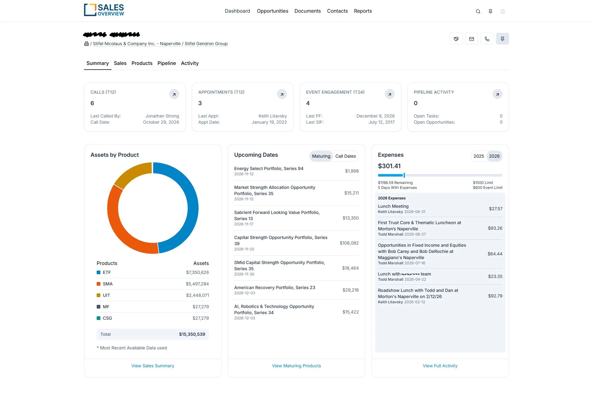
The emerging experience connects sales performance, recent interactions, tasks, opportunities, product information, and other context to better support a wholesaler's next decision.
From discovery to design
Following working sessions and feedback from wholesalers, I translated the findings into an initial whiteboard proposal for the Advisor Page.
I organized the proposed experience around five areas—Summary, Sales, Products, Pipeline, and Activity—bringing existing account information together with new opportunities for sales analysis, relationship management, and follow-up activity.
This exploration helped establish the page's structure and content priorities before engineering implementation began.
Before
Original Sales and Approvals views.
After
Updated Summary, Sales, and Activity views, distinguishing production functionality from ongoing design work.
Knowing when to break the design system
Advanced Search was introduced to give wholesalers more control over how they find, filter, and organize advisor information, reducing dependence on custom searches within Dynamics 365.
Discovery and user feedback helped inform which filters, columns, and data relationships mattered most when preparing call lists, travel plans, and event invitations.
Initially, the design followed the standard page margins established for Sales Overview. However, users needed to see more data simultaneously than that layout comfortably supported.
The trade-off
Rather than force the interaction into the existing template, we allowed Advanced Search to use the full available width.
I worked with the developer on the filter drawer, column selection, and related interaction patterns, balancing flexibility with a consistent experience.
The decision reinforced a principle that carried through the broader redesign: shared standards should support usability, not restrict it.
An intentional exception to the standard layout gave users more room to work with complex advisor data.
Creating consistency across independently developed experiences
Sales Overview is maintained by multiple developers, each responsible for different pages and functionality. Without shared design standards, those independently developed interfaces accumulated inconsistent patterns.
I audited existing interfaces for differences in typography, color, spacing, and components, then developed reusable Figma patterns aligned with the Tailwind and Preline frameworks adopted by the engineering team.
Designing for implementation
Matching design components with available front-end patterns helped establish greater parity between Figma and production, while giving developers a common foundation for new and existing pages.
Our work also required flexibility. Licensing restrictions, technical limitations, and changing business priorities sometimes prevented designs from being implemented exactly as proposed.
Through weekly reviews and direct collaboration, I worked with developers to resolve inconsistencies, adapt designs to constraints, and maintain a cohesive experience while the platform remained live.
A more cohesive platform built around its users
Sales Overview continues to evolve, but its modernization has established a more consistent experience across independently developed tools and workflows.
The new navigation was positively received by users, while expanded advisor information and advanced search capabilities have helped bring previously fragmented activities into a more connected workspace.
The shared design system has also given engineering a more consistent foundation for developing and maintaining the platform.
Oh wow! This is huge, huge, huge! I can't tell you how much time you're saving me. You're probably saving me at least a full day of work per month with these features you're showing me.
Robby Gordon — Wholesaler, First Trust Portfolios
Feedback following a training of Advanced Search, Pitchbook Maker, and the Task System.
What the work reinforced
Modernizing an established enterprise product requires more than creating better interfaces. It requires understanding how people work, prioritizing competing needs, and continuously collaborating with engineering and stakeholders.
One of the most important lessons has been knowing when to establish shared standards and when a particular workflow justifies an exception.