Sales Overview
Establishing governance and system architecture across a fragmented reporting ecosystem
Role
Lead Product Designer
Scope
Design governance, system architecture, cross-functional alignment
Team
Multidisciplinary team of engineers, product specialists, and sales stakeholders
Timeline
2024 — Present
Fragmented reporting experience across independently built tools.
Led audit and introduced unified design system and goverance.
Standardized navigation, component patterns, and visual language.
Increased sales adoption and stakeholder engagement.
Visuals are reconstructed and use fictional data to represent structural design changes while respecting platform confidentiality.
The Organizational Problem
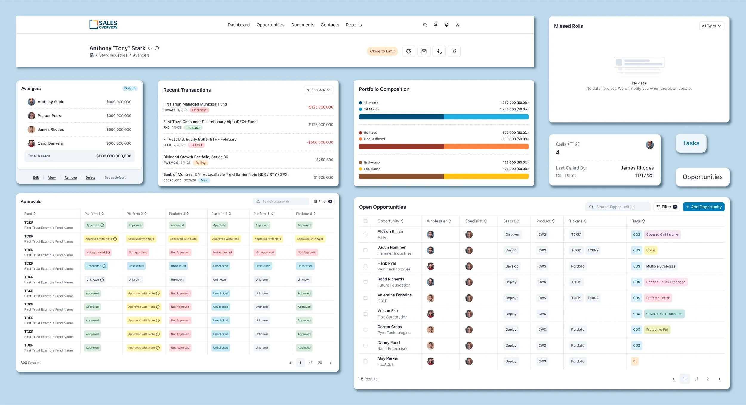
Sales Overview originated as a response to individual sales report requests and gradually evolved into the central touchpoint for sales tools. Over time, pages were developed independently by different engineers, resulting in fragmented interface patterns, inconsistent visual language, and uneven interaction models across the ecosystem.
While the underlying data was valuable, the experience lacked cohesion. This fragmentation introduced inefficiencies for sales teams navigating multiple reports and subtly eroded trust in the platform as it expanded. Sales Overview increasingly functioned as a repository of tools rather than a purposeful, unified system designed to support strategic decision-making.
Strategic Decisions
Reframing Navigation as Architecture, Not Storage
The legacy left-hand navigation constrained usable content width and enabled unchecked growth. With more than twenty items listed in a vertical stack, Sales Overview began to feel like a storage panel rather than a structured platform.
I moved navigation to a concise top-level architecture, reducing visible primary destinations and introducing role-based visibility. This shift reclaimed horizontal space for content, modernized the visual structure, and established a scalable framework for future ecosystems through system-level dropdown integration.
This was not a cosmetic change — it redefined how the platform was organized and how users understood its hierarchy.
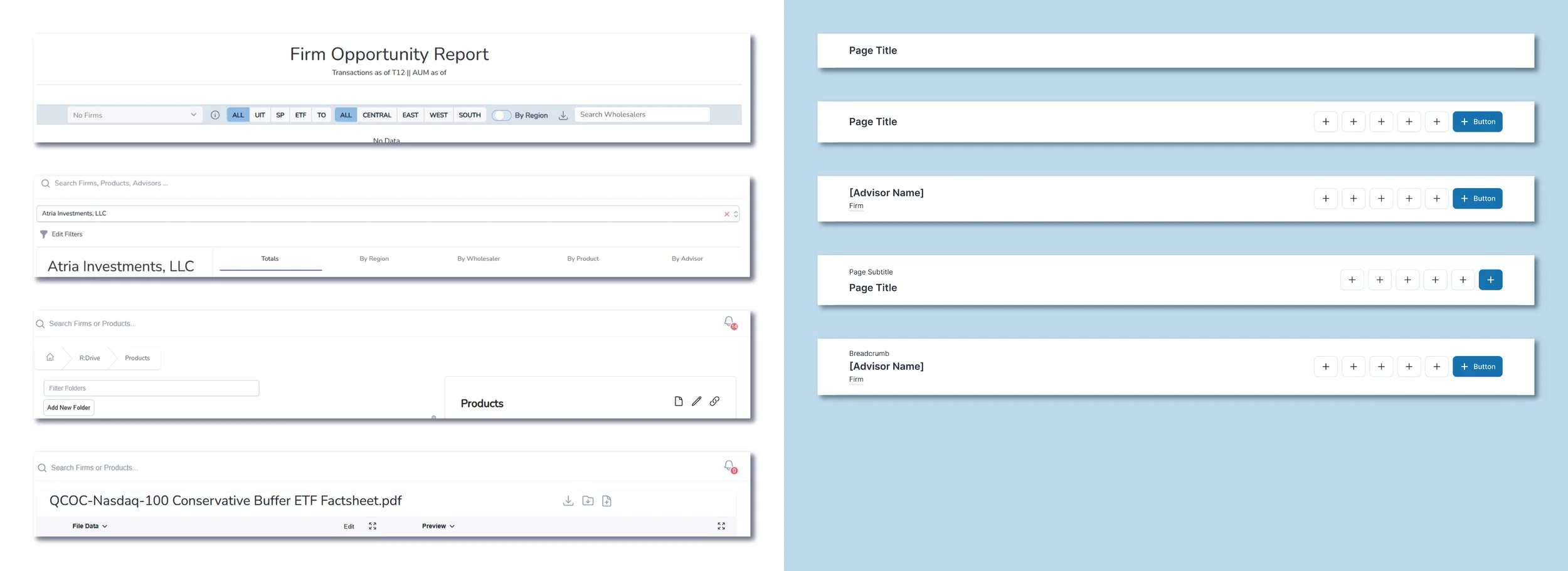
Standardizing Page Architecture to Establish Trust
Page headers were one of the clearest signals of fragmentation. Title treatments, action placement, and structural hierarchy varied widely depending on which engineer built the page.
I introduced a standardized title bar system that defined hierarchy, action grouping, and contextual metadata consistently across all reports. This created visual predictability, reinforced platform cohesion, and reduced cognitive load for sales users navigating between tools.
Standardization here was about more than alignment — it was about restoring platform trust.
Shared Workflows Over Individual Requests
Historically, reports were built as responses to isolated requests. While functional, this approach reinforced silos and prevented systemic cohesion.
Instead of redesigning pages in isolation, I identified shared workflow patterns across the ecosystem and consolidated them into reusable components. This allowed improvements to scale across multiple pages simultaneously, aligned engineers around common standards, and shifted the conversation from “my page” to “our system.”
This was a structural shift from reactive feature delivery to platform-level thinking.
Introducing Governance to Replace Fragmentation
Engineers were previously iterating independently, which resulted in visual inconsistency and divergent interaction patterns.
By establishing a living design system in Figma and formalizing review checkpoints, I introduced governance without slowing momentum. Engineers now build against defined components and consult design early in development, ensuring cohesion while preserving velocity.
Governance became the mechanism that transformed fragmentation into alignment.
Select Visuals
Before
After
Explore a curated collection of my purpose-driven work, where inconsistencies were standardized and fragmented components workflows were unified.
Replaced an overloaded, silo-driven sidebar with a structured top navigation grounded in shared workflows and scalable architecture.
Before
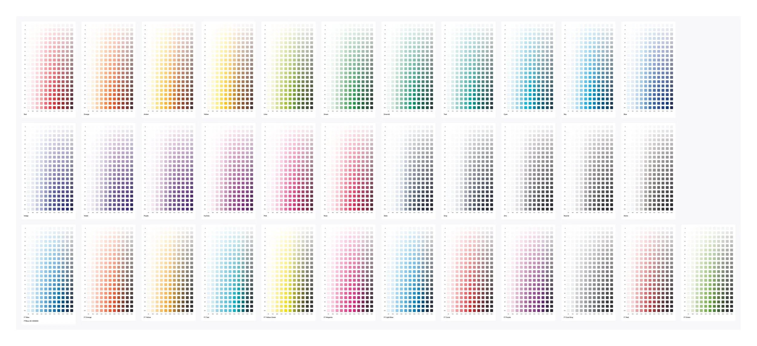
Color System
After
Consolidated inconsistent page structures into a standardized layout system, improving clarity, usability, and implementation efficiency.
Defined a cohesive visual system to unify interaction patterns and reinforce platform trust.
Adoption & Perception Shift
These changes translated into measurable perception and efficiency gains.
-
You're probably saving me at least a full day of work per month... I can't tell you how much thi sis going to change how we're selling products.
— Robby Gordon
-
It's clear how much our internal tools have improved. Advisors would love to see this level of polish across the board.
— Daren Davis
-
Oh Wow... I didn't know we had anything like this. This is awesome! This is going to solve so many problems.
— Tom Pearse