Establishing a Distinct Identity for PTAM
A full-scale brand refresh that positioned PT Asset Management (PTAM) as a stand-alone asset manager, separate from its sister firm, Performance Trust Capital Partners. From logo and color system to sales collateral and presentations, this identity set the foundation for a decade of growth.
Role
Design Lead
Client
PTAM
Timeframe
2015—2016

The Challenge
PTAM needed to distinguish itself visually from its sister firm, Performance Trust Capital Partners. The existing shared brand system limited PTAM’s ability to signal independence and credibility as a dedicated asset manager.
Shared Identity
Operating under the same brand as PTCP blurred PTAM’s value proposition.
Need for Separation
A refresh would support PTAM’s goal of breaking into new ventures and standing apart.
Perception Gap
Materials needed to reflect the quality of a “multi-billion-dollar” shop despite PTAM’s leaner scale at the time.
Scope
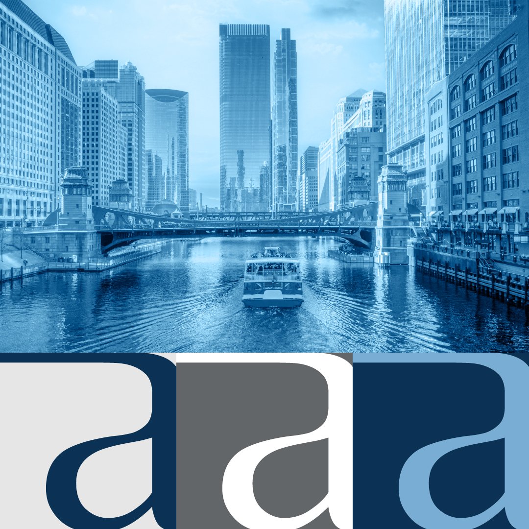
The refresh covered every element of PTAM’s visual identity, from foundational assets to day-to-day sales tools.
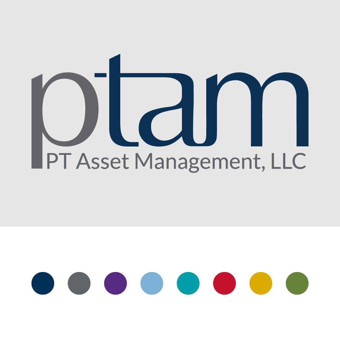
Logo & Palette
Designed a modernized logo and introduced a refreshed color system.
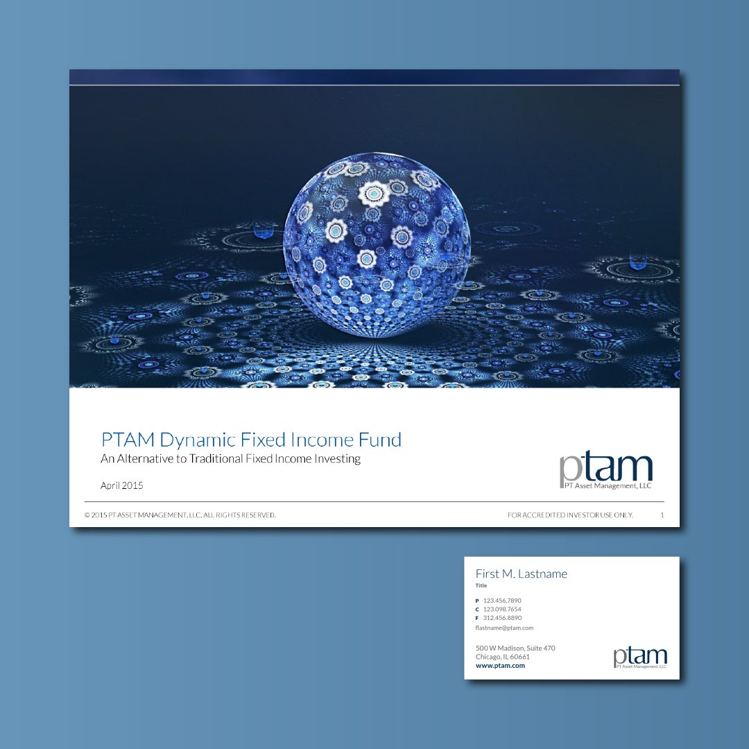
Sales Collateral
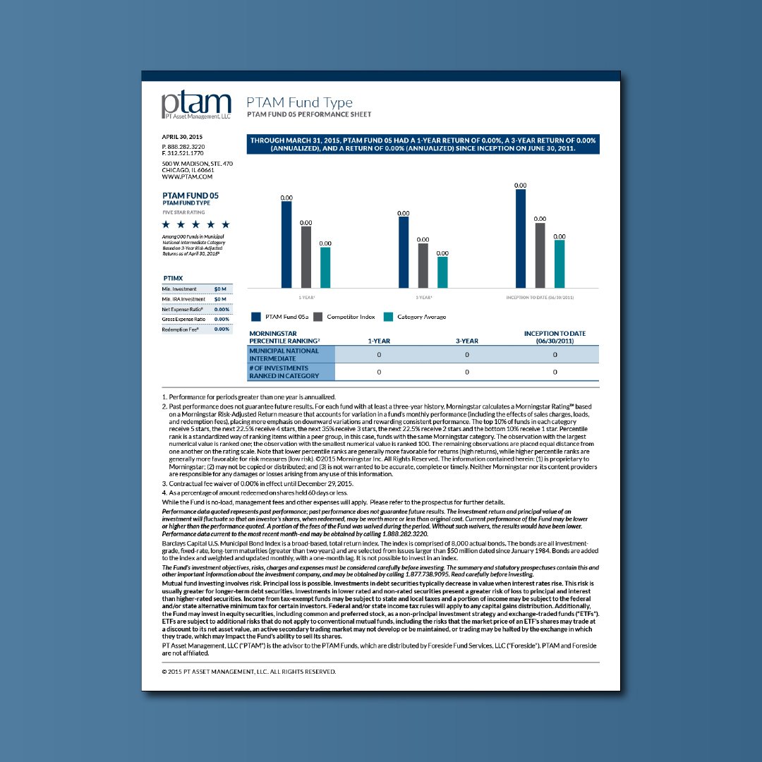
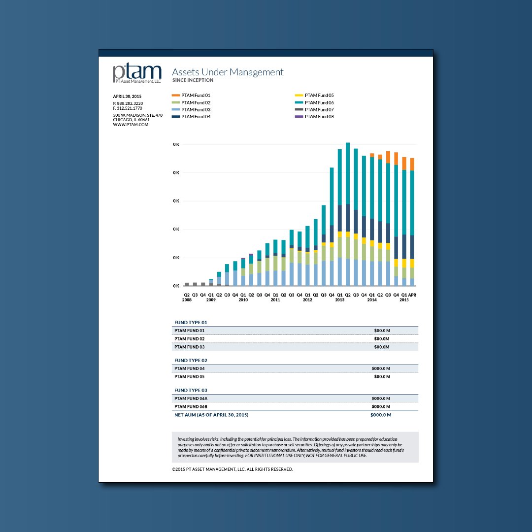
Fact sheets, brochures, white papers, and advisor decks.
Corporate Materials
Business cards, report templates, and internal communication tools.
My Approach
The process combined iterative design exploration with direct executive feedback, balancing creative freedom with high-level stakeholder input.
01. Exploration
Iterated across multiple logo and system directions.
02. Collaboration
Partnered with CMO and leadership for iterative feedback.
03. Executive Alignment
Presented final identity to PTCP leadership for shareholder sign-off.
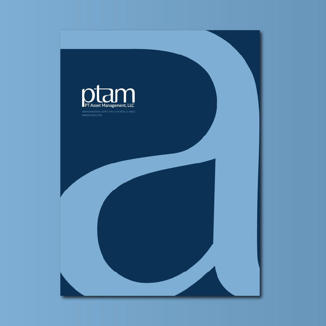
Final Deliverables
The refreshed system modernized PTAM’s identity and extended consistently across collateral.


Your new materials look like they belong to a multi-billion-dollar shop — I never would have guessed your office was this small.
— Prospective Client
Outcome
The rebrand immediately improved perception among advisors and gave PTAM a visual system durable enough to last a decade.
Advisor Confidence
Materials communicated credibility far beyond PTAM’s size at the time.
Scalable Identity
Visual system applied seamlessly across sales and internal materials.
Enduring Impact
Logo still in use in 2025; PTAM grew from <$1B AUM in 2015 to >$10B today.