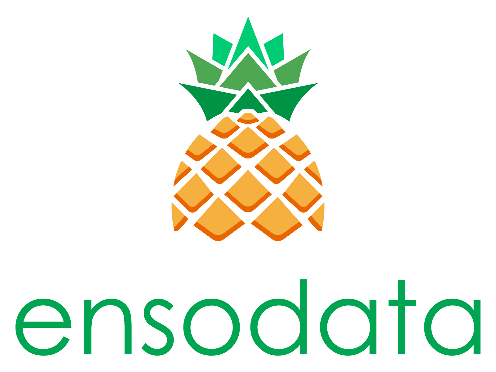
Refreshing a Recognizable Healthcare Logo
Ensodata asked me to modernize their brand identity while retaining the recognizable pineapple mascot that defines their visual presence.
Role
Freelance Designer
Client
Ensodata
Timeframe
2025


The Challenge
Ensodata’s original pineapple mascot was central to their brand, but its illustrative style no longer matched the clean, modern identity the company wanted to project. They engaged me to refresh the logo; keeping the pineapple recognizable, but evolving it into a scalable, versatile mark for digital and print.

Ensodata’s original logomark.
Scope
Logo Refresh
Modernize the existing pineapple mascot and refine the type treatment.
Lockups
Deliver horizontal, vertical, and glyph-only versions.
Palette & Assets
Provide scalable vector assets with updated brand colors.
This project focused exclusively on logo identity refresh. Broader brand rollout assets were out of scope.
My Approach
I collaborated directly with Ensodata’s Senior Marketing Director, Rachel Boer, following a clear step-by-step consultancy process for each project:
01. Brief & Estimate
I received Rachel’s requests and drafted a clear scope of work with defined revision terms.
02. Exploration
Three distinct design concepts, each evolving the pineapple in a new style.
03. Application
Concepts shown across lockups, glyphs, and contextual use cases (like apparel and backdrops).
04. Delivery
Final assets provided in scalable formats with a refreshed color palette.
Refined Concept
I delivered a refreshed mark and brand system updates, building on Ensodata’s recognizable pineapple while modernizing its form and applications.


Outcome
A refreshed identity rooted in recognition
The new logo concept honored Ensodata’s existing pineapple while offering modern, scalable design systems adaptable across print, digital, and event use. This final direction gave the team clear, versatile options for evolving their brand identity.